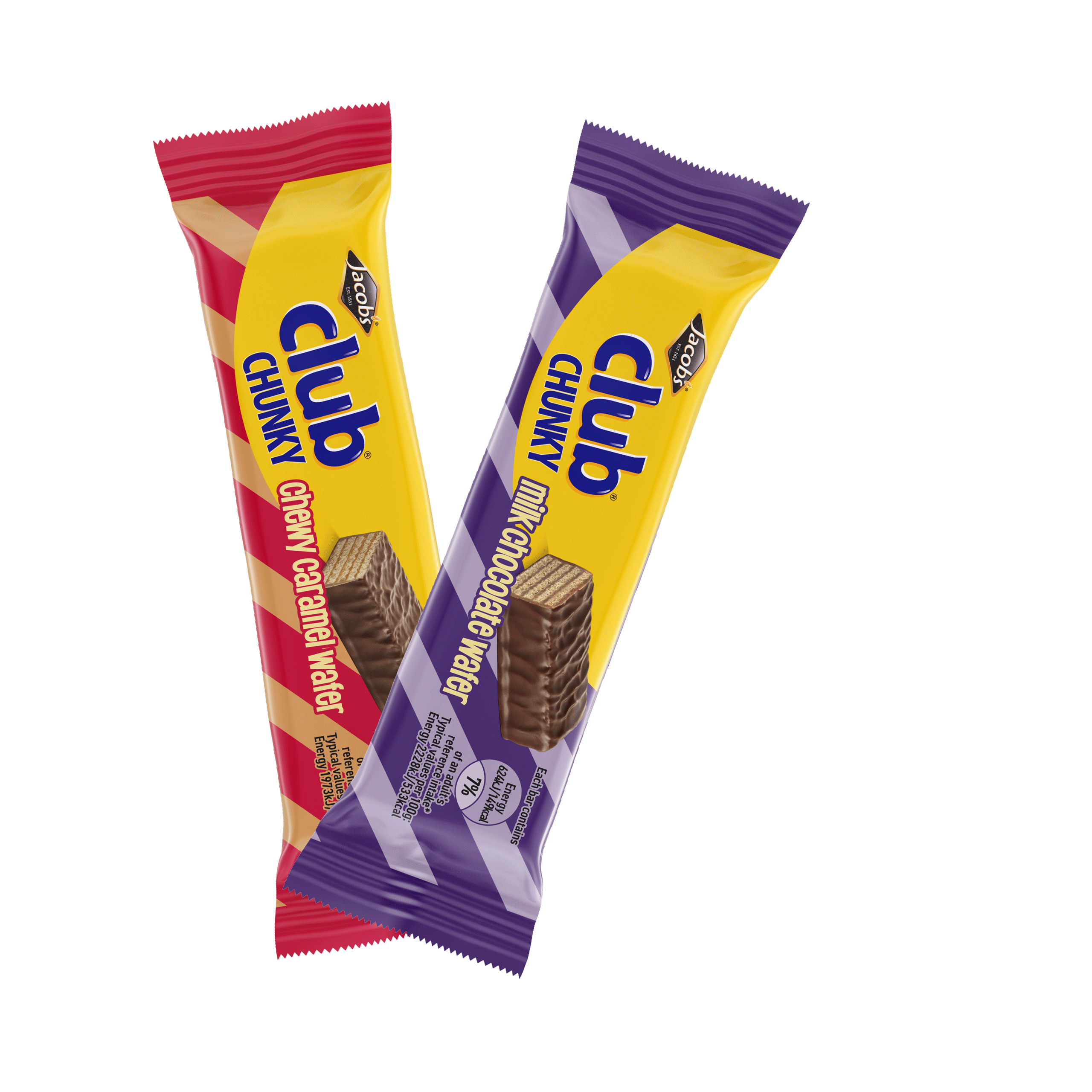
Jacobs ClubChunky Packaging
The Brief
Jacobs Club is a brand we all know and many will have fond memories of the original Club Milk snack bar. Over the years, the range has expanded with additional flavours and new products, including Club Wafer in peanut and chocolate varieties. Having previously worked on the packaging for those two SKU’s, this brief was to develop a new sub-brand – Club Chunky.
The brief was for big & bold with the core Jacobs Club brand at the heart of the design. Unusually, the brief also dictated that an alternating candy stripe be utilised in the design. This packaging design project was about delivering a fun, approachable extension to the Club confectionary brand.
DesignSolution
Taking the iconic yellow roundel as the obvious starting point, the Jacobs/Club logo proportions were tweaked to incorporate a heavy (read ‘Chunky’) typeface. Product photography was commissioned and art directed and as per the brief, a diagonal stripe was incorporated into the design as a base element. A bold colour palette referenced established category flavour cues and complemented and contrasted with the Club logo lockup. The alternating stripe leveraged the foil outer wrap substrate, to create an alternating high metallic sheen on darker stripes for strong standout on shelf. In addition to the inner and outer wraps, SRP’s and FSDU’s were developed for retail shelves and floorspace promotion.