Wilton CandyRefresh
The Brief
Following the acquisition of Wilton Candy, famous for their Macaroon chocolate bar, a new improved recipe for their Macaroon and Mint Crisp varieties was ready for launch. With this came a new bar format and the marketing team felt there was an opportunity to refresh the packaging design and identity.
It was important to ensure that the refreshed aesthetic didn’t lose the brand recognition that had been built up over decades as a firm favourite in the Irish confectionery space, and clear parameters were agreed in considering the brief to ensure that familiarity wasn’t lost.
DesignSolution
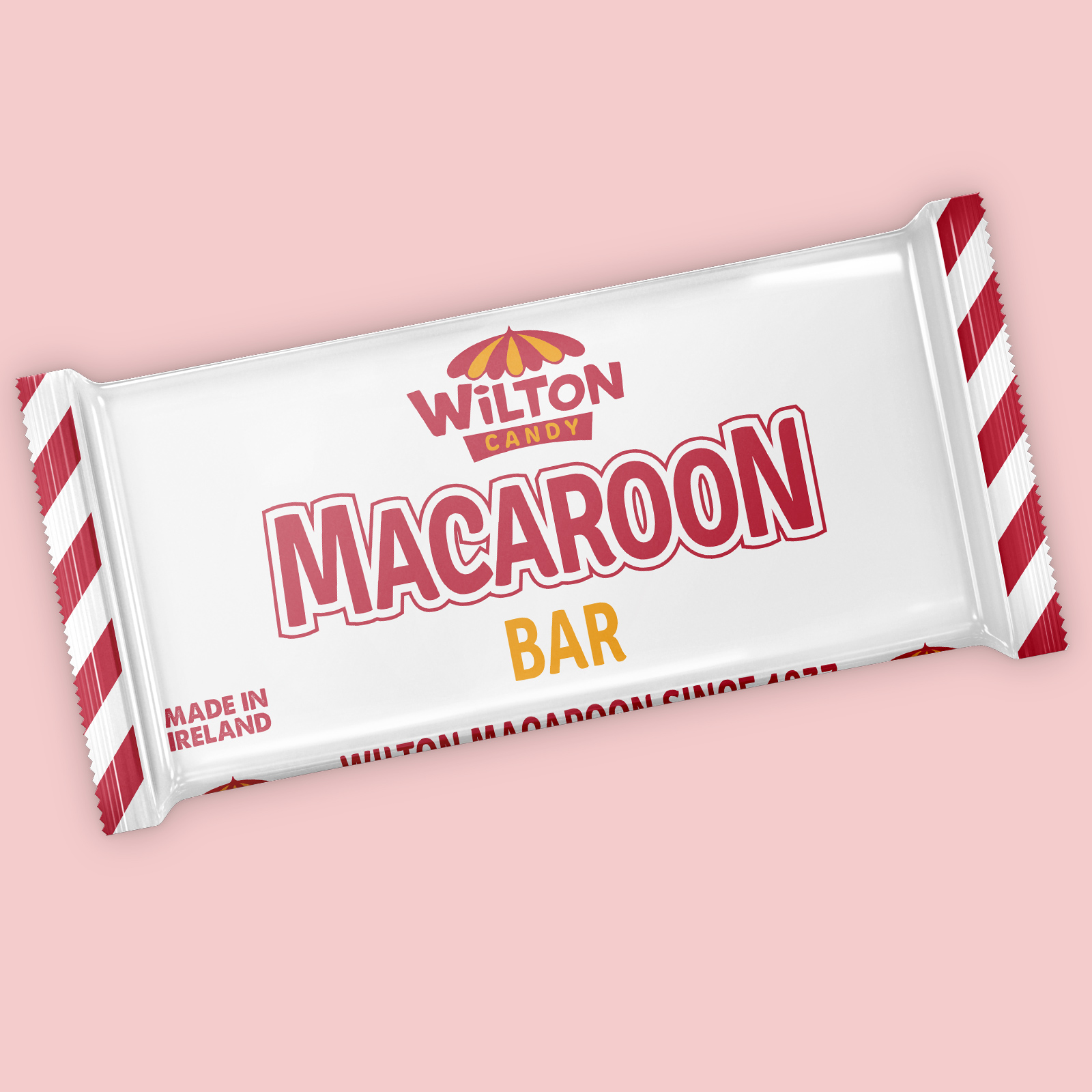
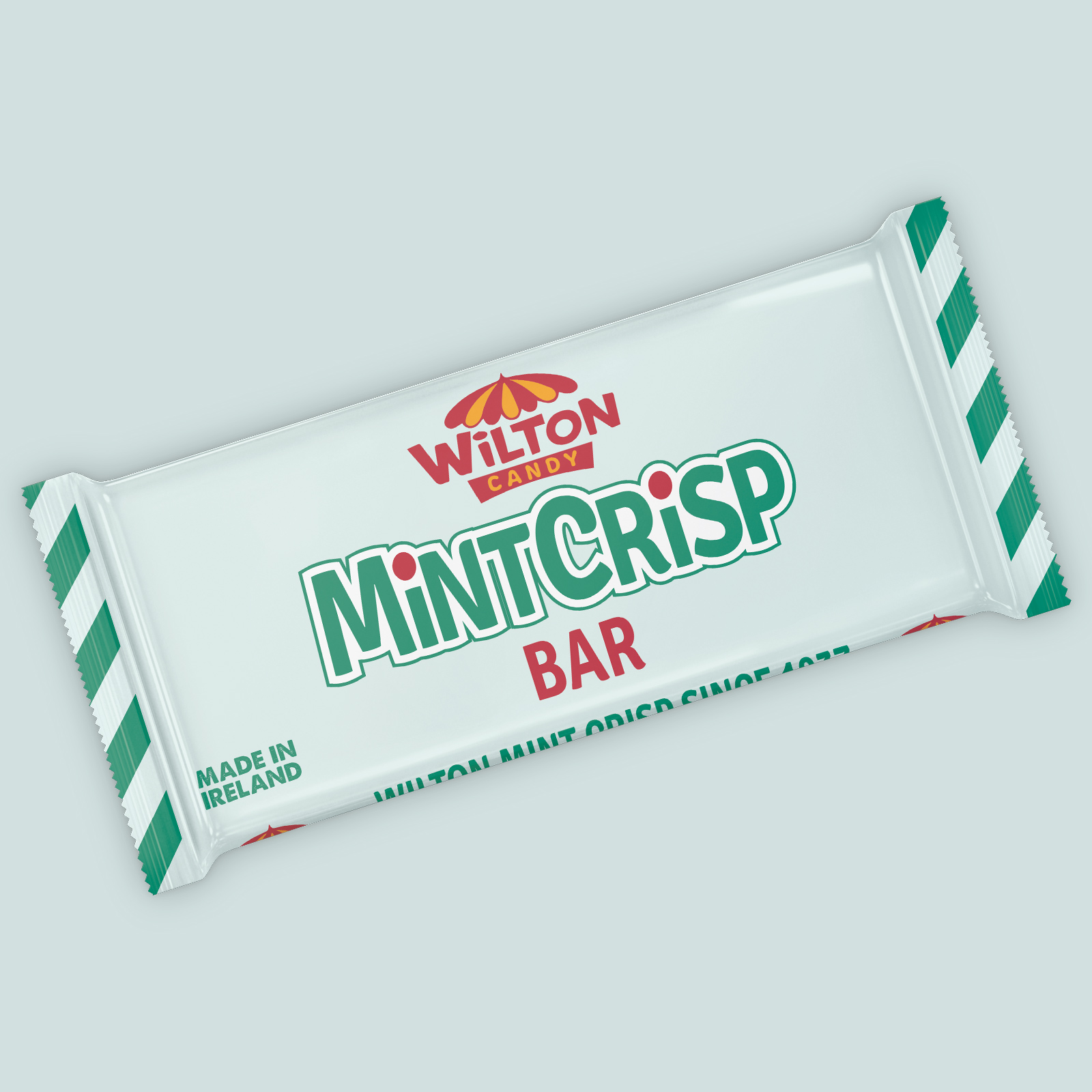
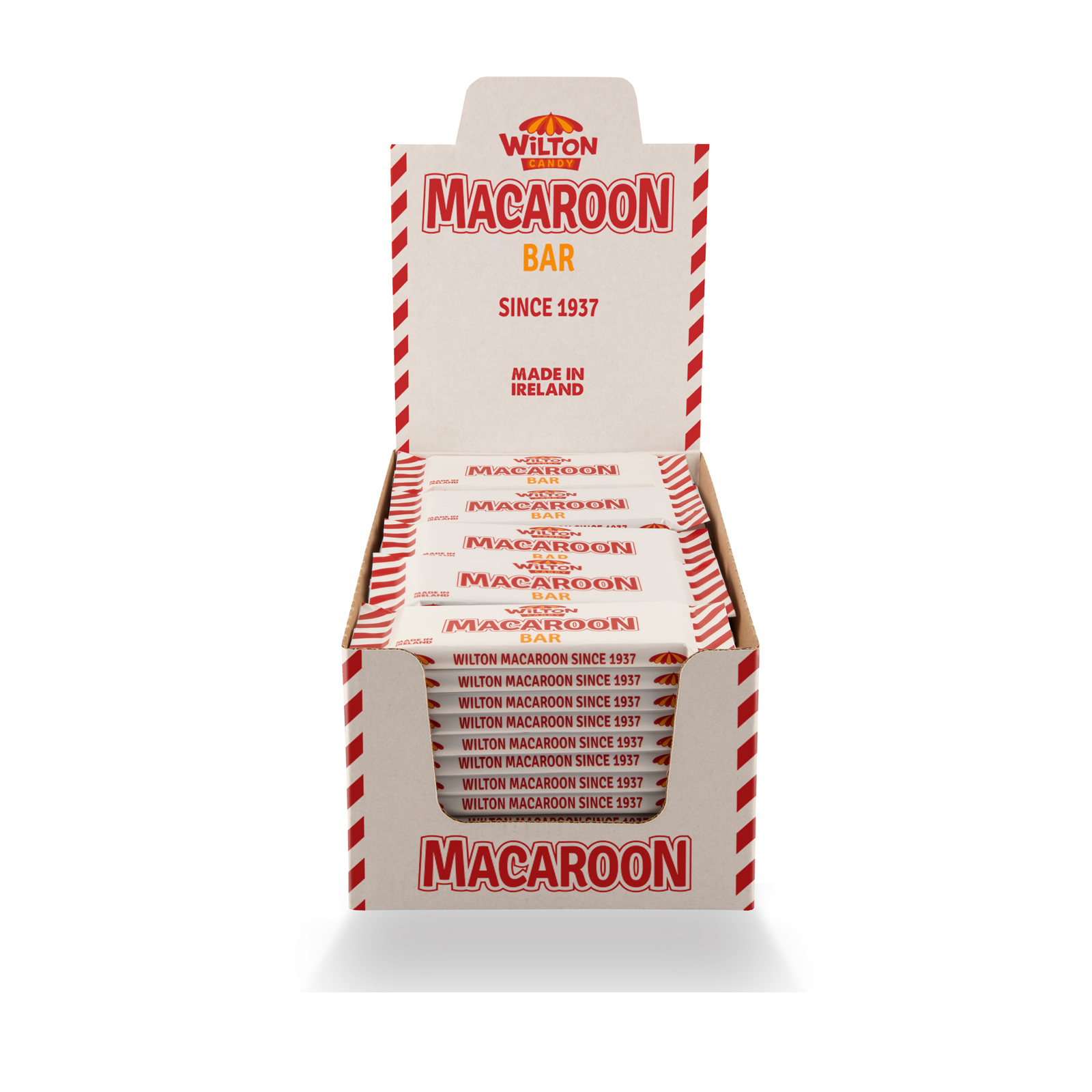
I gave the iconic umbrella logo a careful overhaul, to clean up the line work and formalise the colour palette, whilst retaining the charm of the original design. The original waxed paper was being replaced by a tight wrap film, required by the new bar format production line. I updated the pack typography and applied a traditional candy striping to the sealed edges, again with reference to its iconic predecessor. A ‘Made in Ireland’ statement and heritage statement were introduced on front and side of pack respectively in a further nod to the heritage of the brand.
Pointof Sale
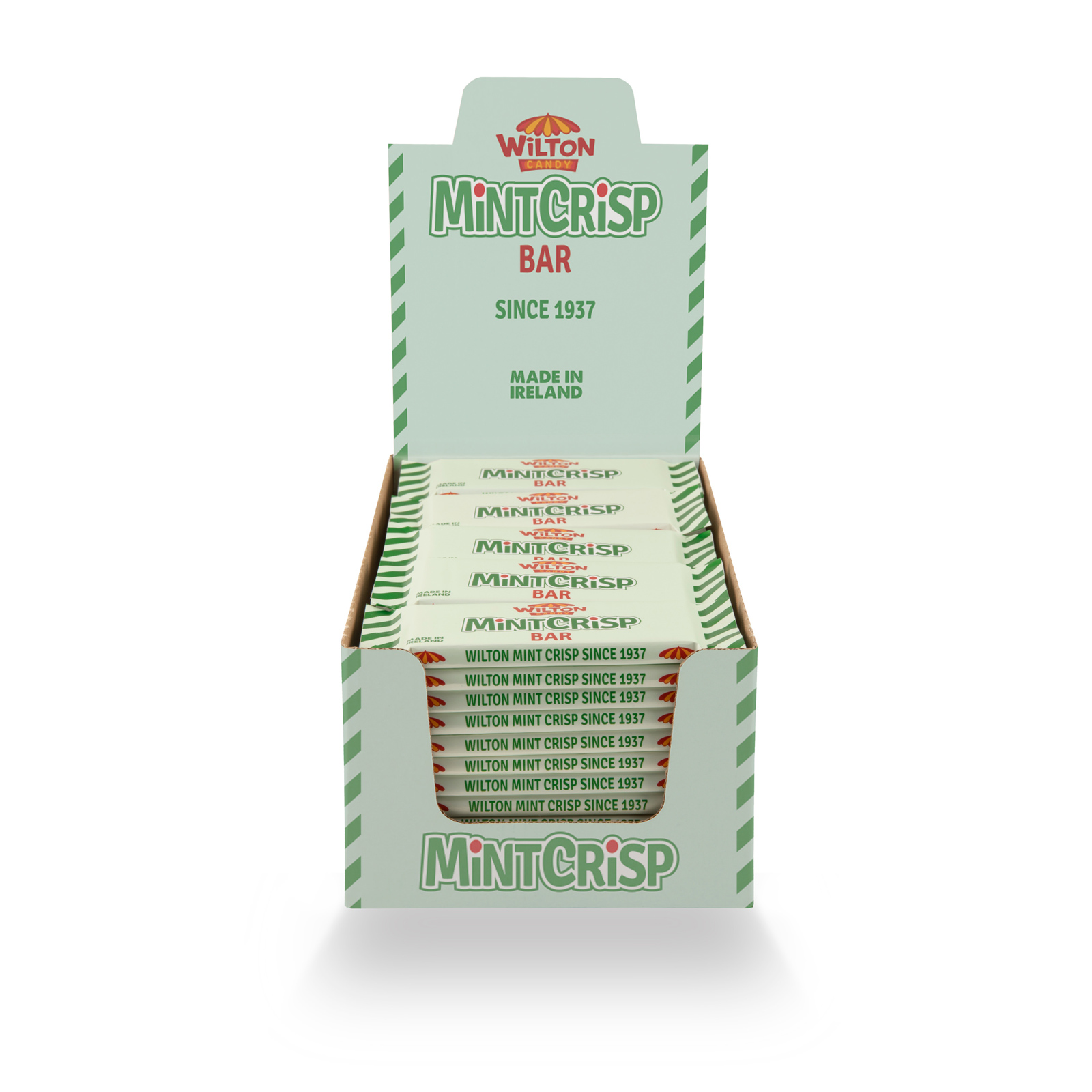
A countertop display unit (CDU) for each of the flavours was also designed to match the updated look, maintaining the traditional promotional presentation format so familiar to the brand’s customer base, whilst accommodating the new elongated bar format.


