


OdlumsBreakfast Range
The Brief
Despite being the category leader in baking, the brand equity Odlums enjoyed had not translated as well on the breakfast aisle. The existing Porridge Oats and Wheat ranges had become disjointed in terms of visual design over the years, to the point where the brand risked losing shelf space to new category entrants and supermarket own-brand.
Facing an increasingly competitive environment, Odlums were looking for a design overhaul of the range to deliver a new cohesive look across all SKU’s, to maintain and build the brand presence in retail partners. Post relaunch, the brand has enjoyed significant growth in market share on both core Porridge Oats and Wheat ranges, building a full range presence on the breakfast aisle.
DesignSolution
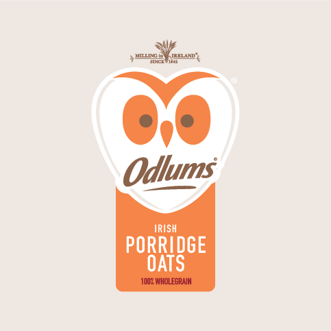
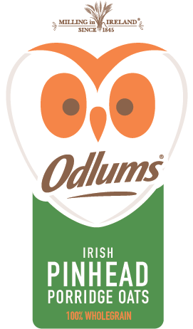
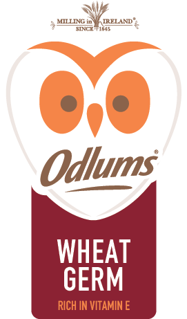
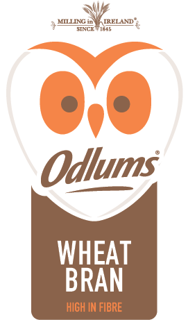
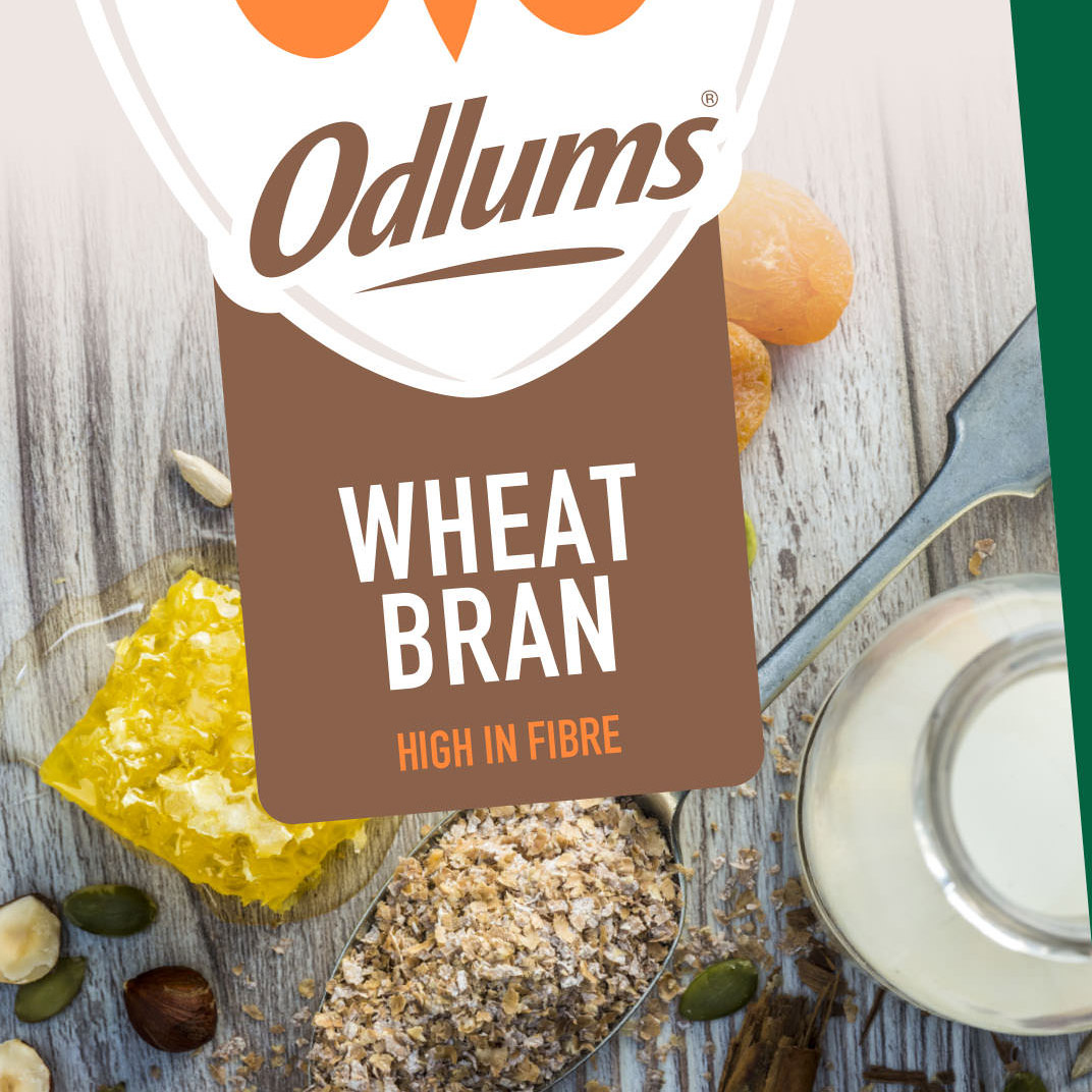
Leveraging the brand power of the iconic Odlums Owl device; a new logo lockup was developed, with the brand mark tweaked slightly to ensure consistent application across paper and film substrates. The typeface was chosen for its legibility and simplicity, and combined with the new graphic holding device, provided visual cohesion across the range. A new, bolder colour palette was developed to differentiate the oats and wheat ranges and SKU variants, whilst also complementing the familiar brand mark.


Commissioning& Art Direction
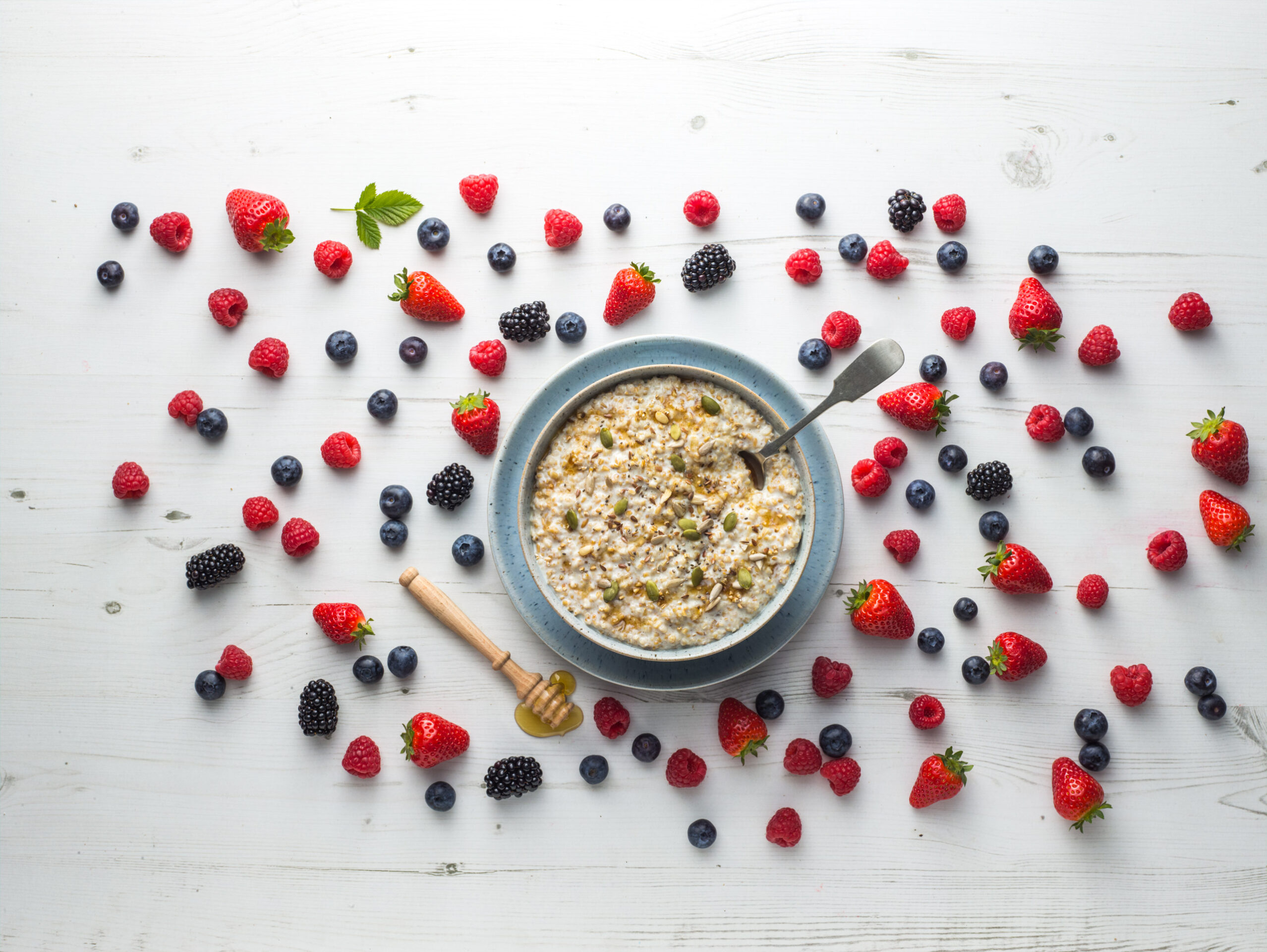
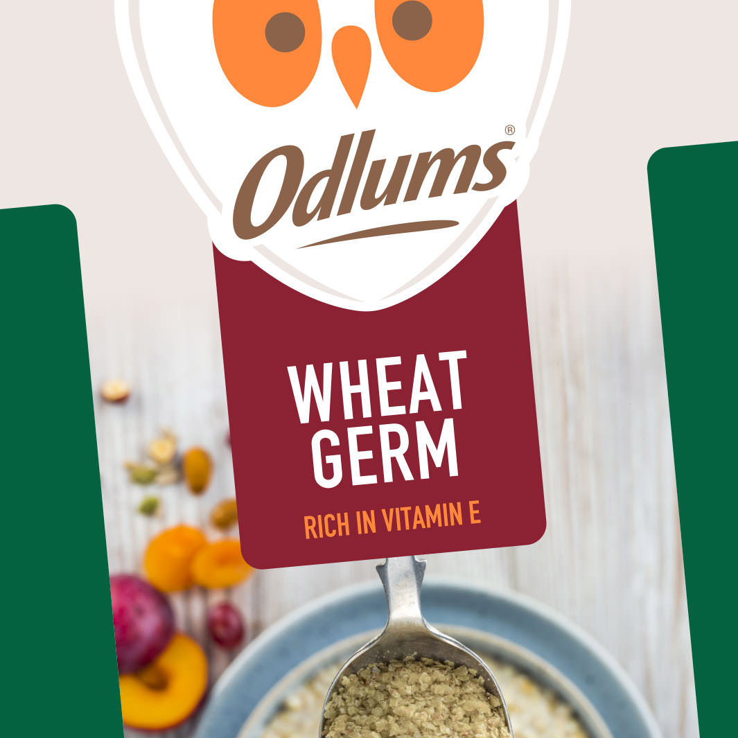
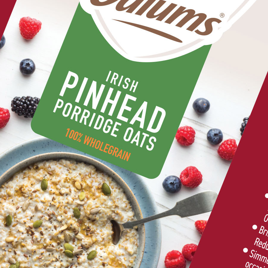
Styled, flat-lay food photography was commissioned to complement the bold graphic elements and enhance the premium look and feel of the new design. This flat-lay approach made the product the hero, shot in a serving suggestion style; with pops of colour from fresh fruit, layered over tactile surfaces with rustic crockery and spoons. The pack design provided a ‘window’ into this scene, and what the customer could do with the product at home.
I provided the creative direction for the shoot concept and art directed on the day working with the photographer and food stylist to ensure the layouts worked in the context of each of the approved pack designs; whilst also highlighting the natural product ingredients, driving taste appeal and providing serving suggestions to shoppers.
ART DIRECTION
Packaging Design
A market leader with a rich heritage in baking, Odlum’s have built a deserved reputation for quality over generations. A staple in family kitchens, the famous owl is iconic; familiar and nostalgic. In developing a new design language for Odlums’ breakfast aisle range, this iconic device would be central to the new design.
It’s application had become recessive and inconsistent across the range previously. Now it was scaled up, unapologetically dominating the front of pack. A colour palette was developed to differentiate core range oats, pinhead oats, quick ‘n’ easy, and wheat SKUs. Colour blocking, bold typography, and photography focused on serving suggestions to drive taste appeal, were brought together; anchored by the Odlums’ logo device.
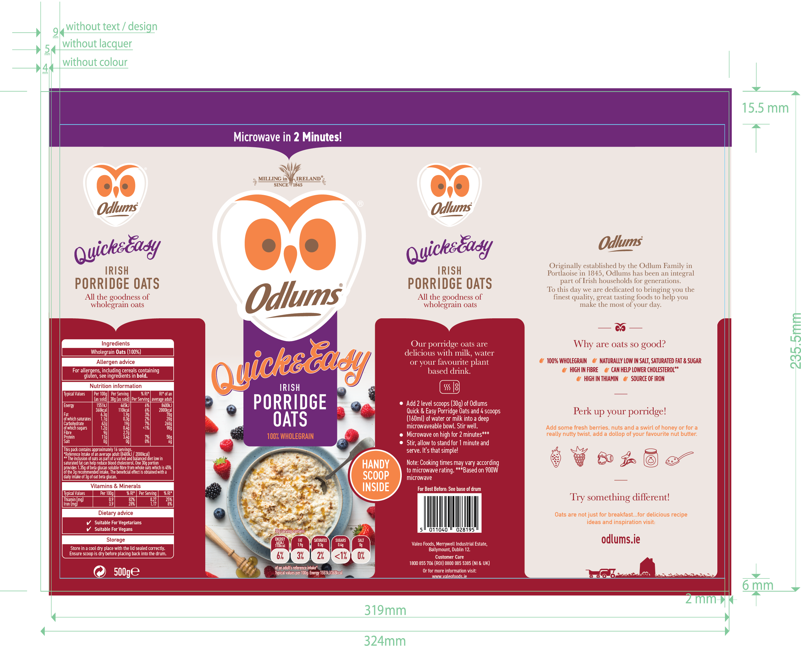
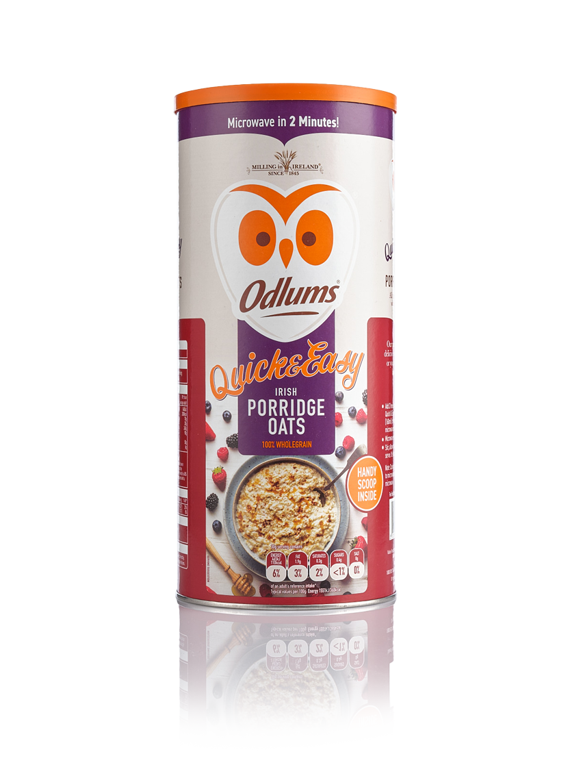
There were multiple pack formats to consider; coated paper stock, cylindrical pack and plastic substrates, with varying capacities and promotional SKU variants. To build shelf presence for the brand, these different pack formats needed to work independently and as a range, to draw a shoppers eye, competing with market leaders and supermarket own label.
The design solution ensures that front of pack consistency is maintained regardless of format or substrate. Equally, the brand story on side of pack and nutritional/regulatory information is again clearly and consistently communicated in a carefully selected highly legible typeface. Subtle references to arable farming, harvesting and milling round out the packaging design language.

Project Services& Delivery
This brief called upon all areas of expertise in creative direction, art direction, packaging design and print management. Working with the in-house marketing team at Valeo Foods to deliver a commercially critical project; this was an exciting and challenging brief, that offered an opportunity to work with one of Ireland’s leading household brands.
- Scoping & Brief Development
- Creative Direction
- Art Direction
- Graphic Design
- Artworking
- Commissioning
- Print Repro & Management