OdlumsPackaging
The Brief
Despite being the category leader in baking, the brand equity Odlums enjoyed had not translated as well on the breakfast aisle. The existing Porridge Oats and Wheat ranges had become disjointed in terms of visual design over the years, to the point where the brand risked losing shelf space to new category entrants and supermarket own-brand.
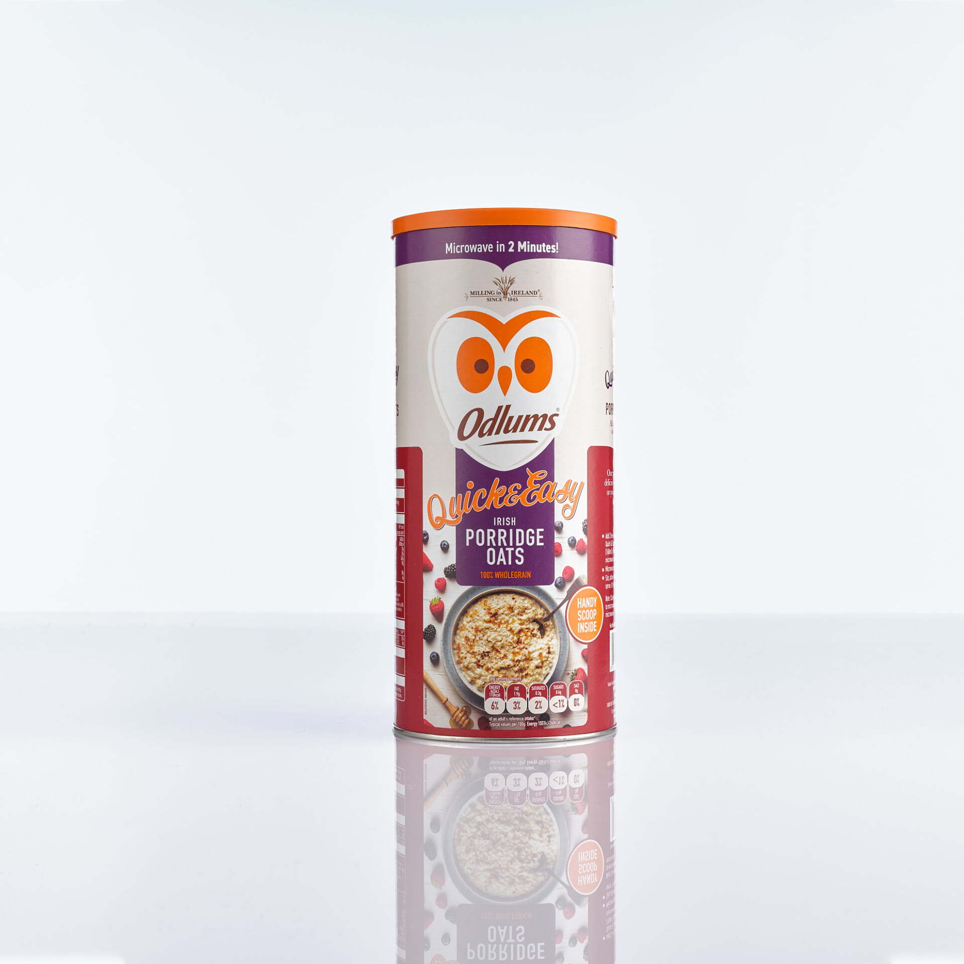
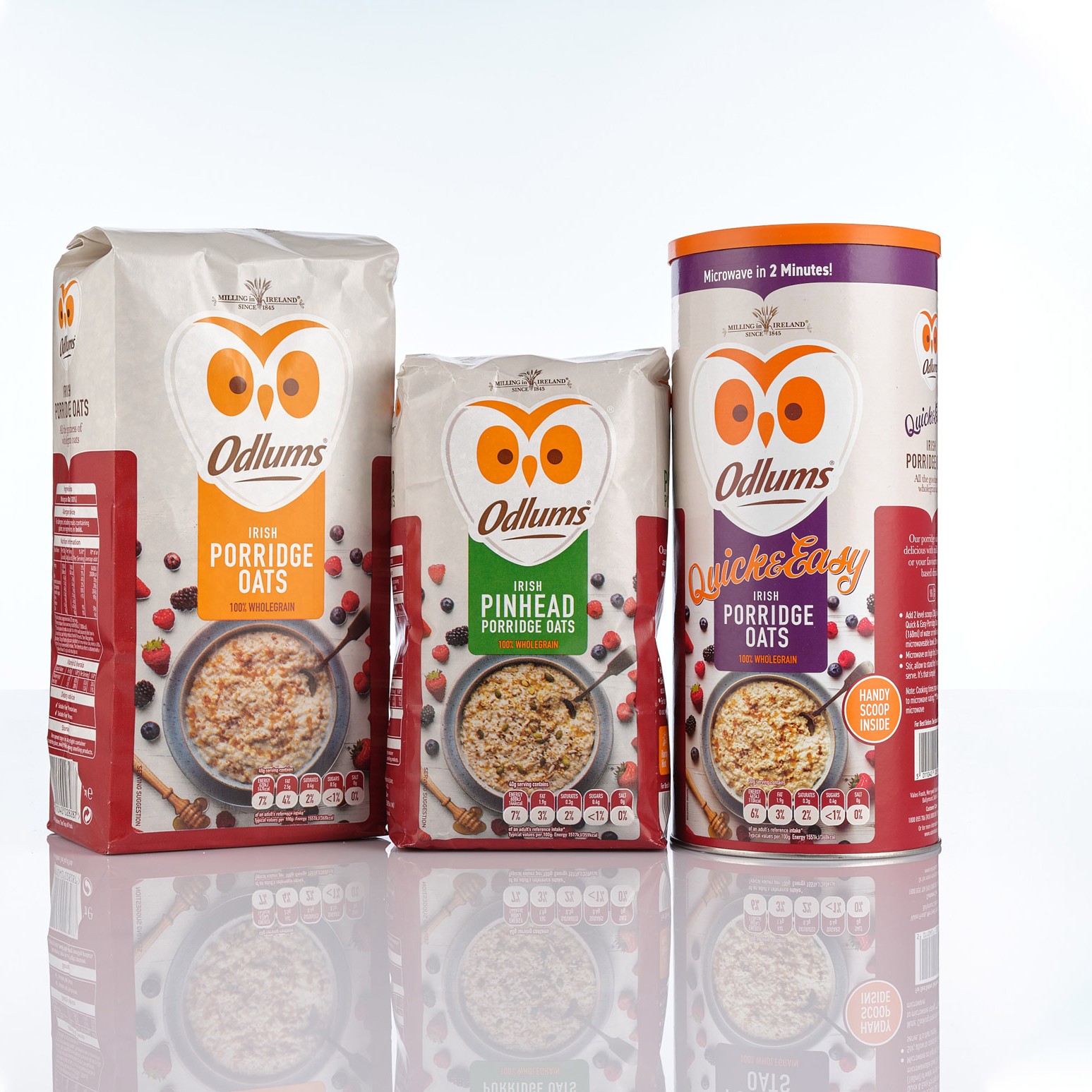
Facing an increasingly competitive environment, Odlums were looking for a design overhaul of the range to deliver a new cohesive look across all SKU’s, to maintain and build the brand presence in retail partners. Post relaunch, the brand has enjoyed significant growth in market share on both core Porridge Oats and Wheat ranges, building a full range presence on the breakfast aisle.
DesignSolution
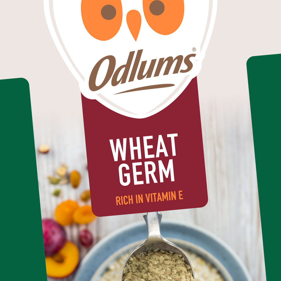
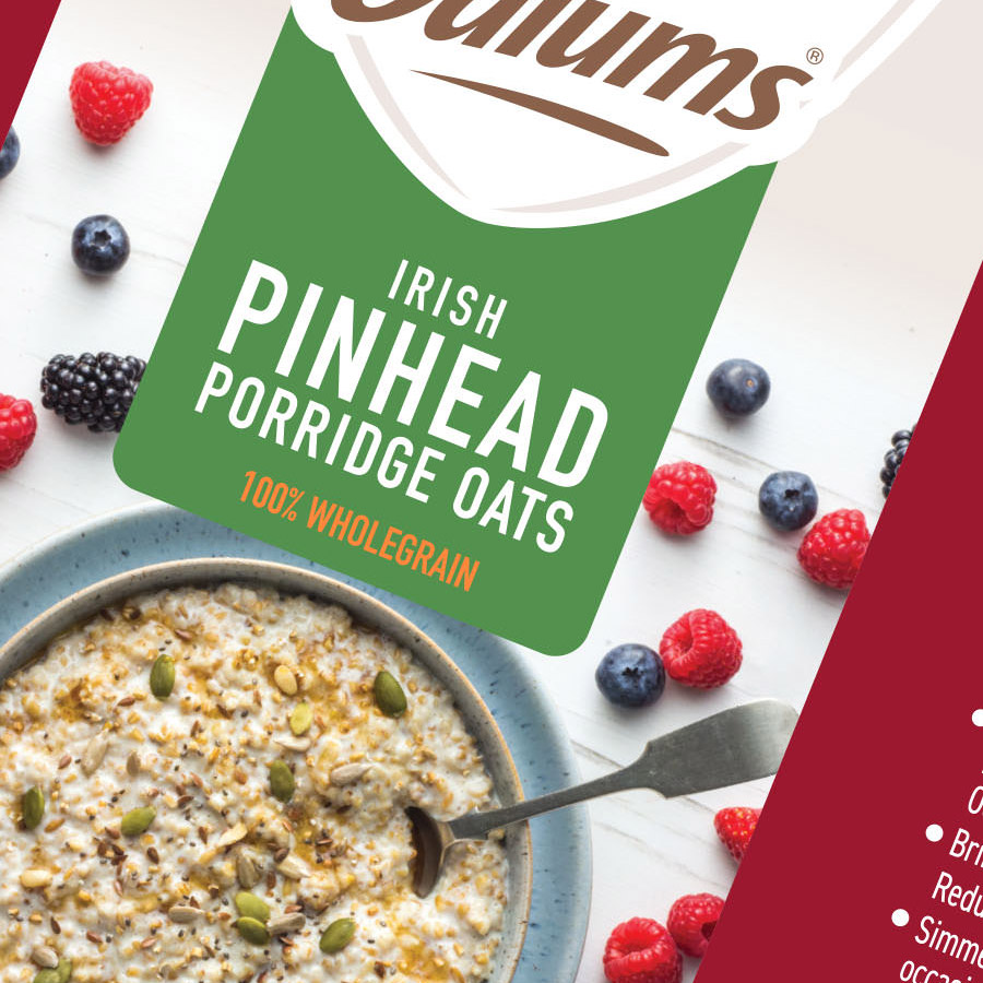
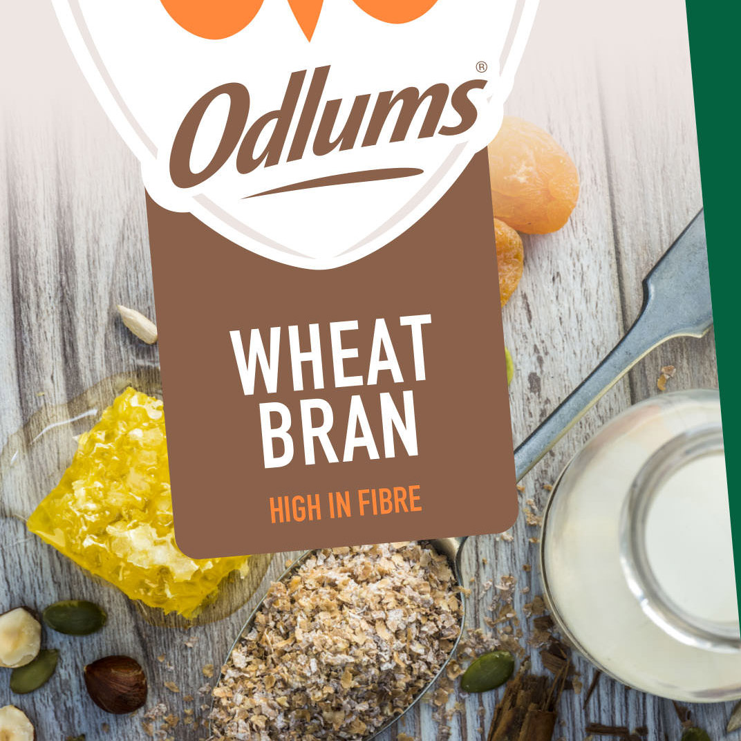
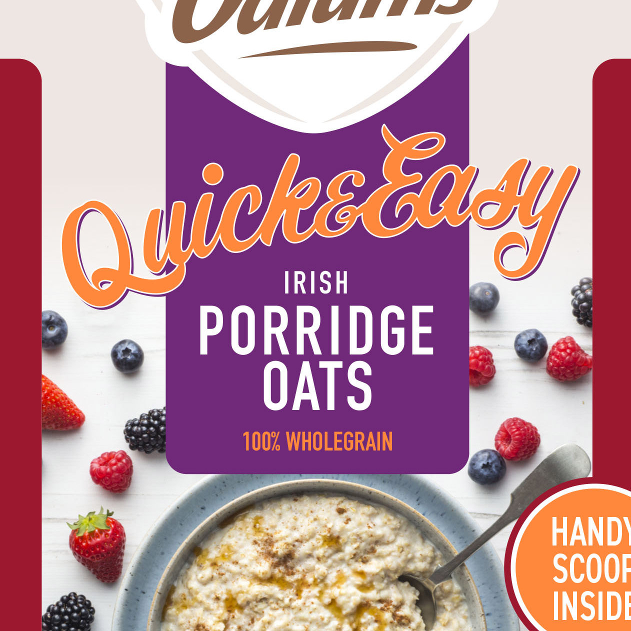
Leveraging the brand power of the iconic Odlums Owl device; a new logo lockup was developed, with the brand mark tweaked slightly to ensure consistent application across paper and film substrates. The typeface was chosen for its legibility and simplicity, and combined with the new graphic holding device, provided visual cohesion across the range. A new, bolder colour palette was developed to differentiate the oats and wheat ranges and SKU variants, whilst also complementing the familiar brand mark.
Commissioning& Art Direction
Styled, flat-lay food photography was commissioned to complement the bold graphic elements and enhance the premium look and feel of the new design. I collaborated with the photographer and food stylist on set, to provide the creative direction on the shoot, working with them to ensure the layouts worked in the context of each of the approved pack designs; whilst also highlighting the natural product ingredients, driving taste appeal and providing serving suggestions to shoppers.


