Kinta8Consulting
The Brief
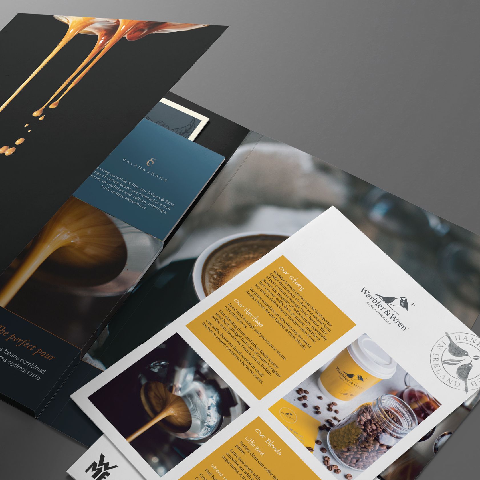
Kinta8 is a retail consultancy, linking suppliers with buyers through cultural advisory, strategic pitch preparation training and representation services. Their service is based around 8 key processes, to develop tailored customer engagement strategies based on clients’ business model & ambitions.
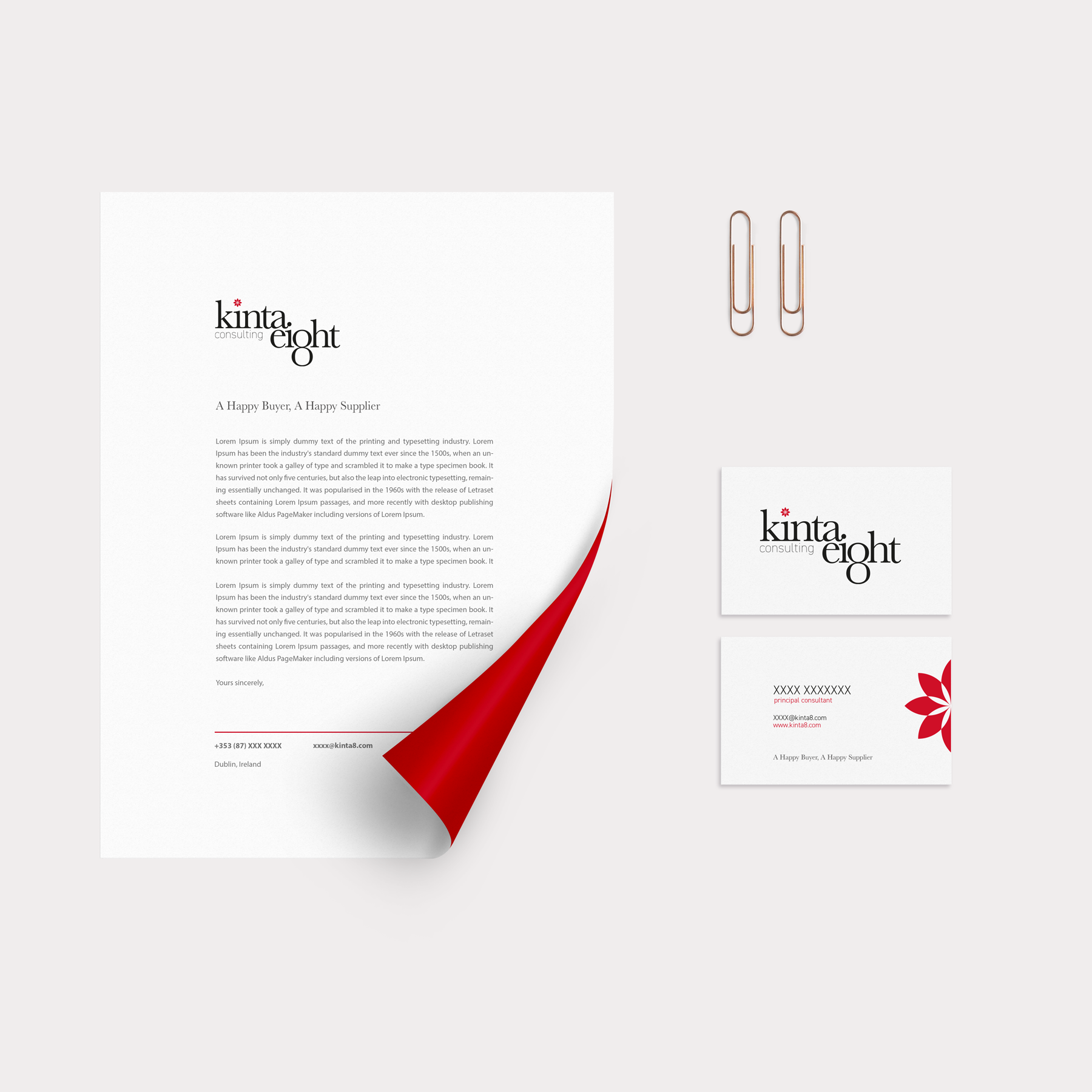
I was tasked with developing a brand strategy, name, identity design and a copywriting tone of voice, along with print materials including stationery, presentation folders and a brochure website.
DesignSolution
Having developed the consultancy name, the identity was composed of 3 key elements. The icon is derived from the 8 key processes and carries through all materials in a palette of charcoal grey, white and red, a colour which carries symbolic importance in eastern cultures. The wordmark leverages the figure 8 to replace the ‘g’ in a further nod to eastern symbolism and the importance placed on numbers. The customised serif typeface, minimalist design aesthetic and sophisticated palette carried across all elements of the brand; underpinning their professionalism and the premium service they provide. The patterns developed around the icon can be carried through from small stationery and brochure applications to physical spaces as a striking backdrop, and scale up and down as required for maximum impact.
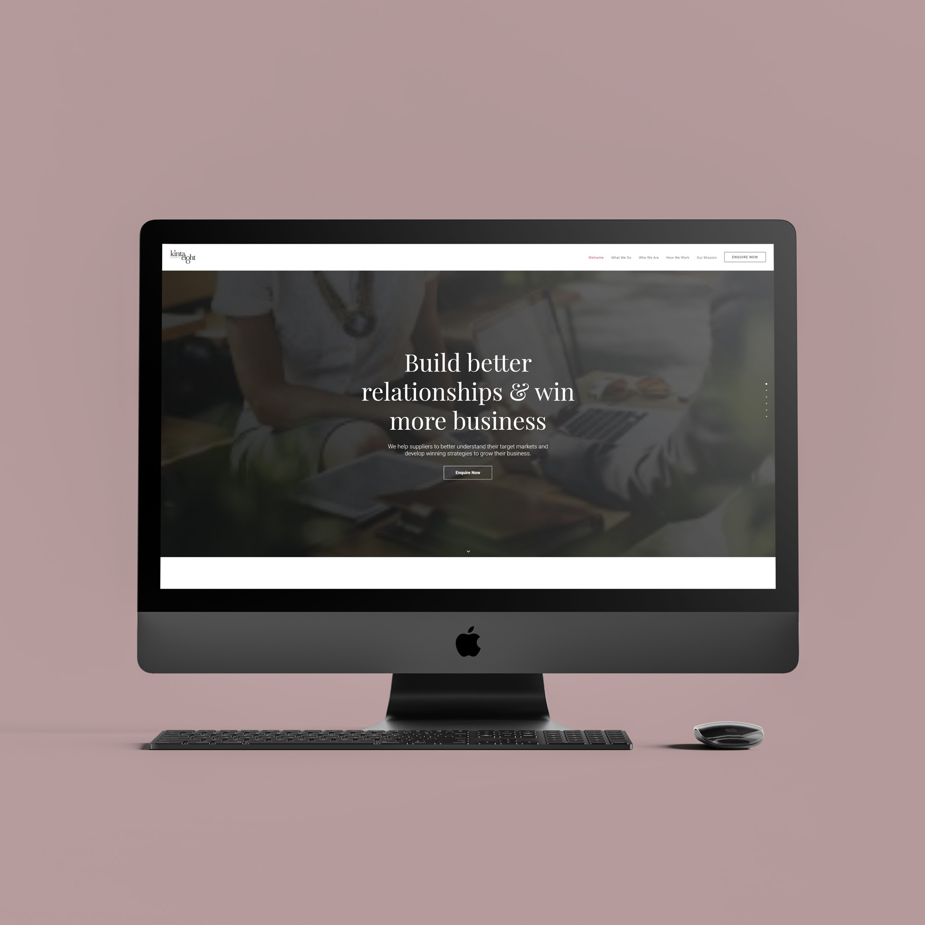
WebsiteDesign
As part of a soft launch, they also required a landing page to provide a brief overview of the service and capture client information at events.