Mahers ChemistRebrand
The Brief
Management of this family owned independent chemist in Drogheda had just passed to its second generation and they wanted to reposition their brand and refresh their identity alongside a physical store refit. They were keen to communicate the breadth of service they provided to the local community from their central location in the town and reach a new audience, alongside the established customer base.
Beyond the traditional dispensary service, Maher’s Chemist have a renowned photographic department operating alongside cosmetics, beauty and family offerings. They wanted to highlight these categories, and in particular the photographic department which had been a key revenue driver for the business over the years, and one they were keen to maintain and build upon.
DesignSolution
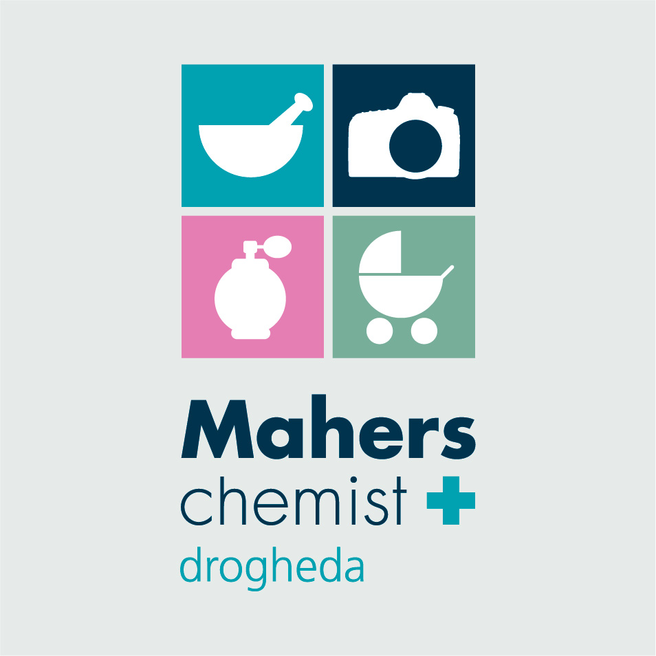
Branding in this sector can be quite formulaic so I looked to differentiate the business from the multiple other competitors in the town through the use of bold shape and colour in their new identity. I developed a set simplified icons that clearly communicated each department function. The choice of a single sans-serif typeface, in different weights, provided an air of modernity and confidence, yet the overall identity, critically maintains an approachable, family oriented tone of voice.
Design Application
Applied across exterior and interior signage, the ‘master’ logo could be easily deconstructed for each department with colour blocking, iconography and typography clearly identifying each function in the store for customers. The photographic department’s partnerships with manufacturers and ‘Pro Centre’ status was also accommodated with logo variations; Dispensary notes, invoices and stationery were all redesigned – with variations on the logo lockup providing scope for a confident and eye-catching angled application on the chemist’s carrier bags.


